
A huge expansion for RotWK, adding multiple eras, numerous new factions and a full campaign. |
| Welcome Guest ( Log In / Register ) |
 |
Quick Lists Top RatedTutorials Living World Map G Ultimate beginner' Arrow scaling bug Raising Heroes max Proper Fire Arrow Creating an asset. Simple Structure B Making a simple Ma Quick and easy sno Making patrols nea Mods The Dwarf Holds The Peloponnesian RJ - RotWK The Elven Alliance Helm's Deep Last H The Elven Alliance Special Extended E Kings of the West RC Mod The Wars of Arda Downloads BFME1 1.06 Widescr Enhanced W3D Impor Fudge's Map Pack LotR/BfME HD Logos Osgiliath Shellmap Crystals Of Ancien 2v1 Wold The forests of Dru Converted BFME2 an ROTWK animations f |
||||||||||||||||||||||||||
 |
Register and log in to move these advertisements down Skinning in Layers
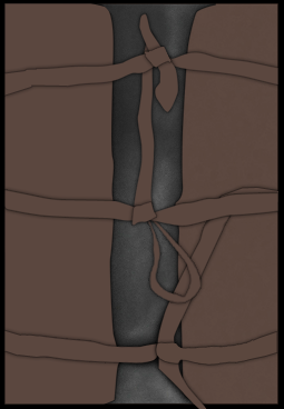
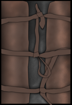
STEP 3 - shadows and highlights  Now let's give some depth to these shapes starting with the bottom one. Go to Window>Brushes, this will open the brushes tab if it isn't already opened, I'll be setting up the basic shadows (burn tool) and highlights (dodge tool) so I use a big brush, roughly 30-50 pixels with 0% hardness and I select Shape Dynamics>Size Jitter/Angle jitter at around 30% and Scattering also at 30%, I also enable Noise. Both the burn and dodge tool are set to Midtones and again at 30%, burn the areas that have something in front of them and highlight a few areas. When you use smaller brushes it's better to disable scattering and sometimes the shape dynamics I normally leave noise enabled. STEP 4 - depth and color  When you add color into the equation you'll have to deal with saturation when using dodge and burn, these are the setting I normally use to keep it in check: Dodge tool -Highlights 5-15% increases the saturation a lot -Midtones 15%-30% increases the saturation a bit -Shadows depends decreases the saturation a lot Burn tool -Shadows 5-15% increases the saturation a lot -Midtones 15%-30% increases the saturation a bit -Highlights depends decreases the saturation a lot 90% of the time I only use midtones but if I want something very bright I use dodge with highlights selected or if I want something very dark I use burn with shadows selected, the inverse settings I use to decrease the saturation in some areas, you can also use the sponge tool. In this case I used dodge in the middle with a big brush 90px and used burn in the areas closer to the edges. With a smaller brush I burned the area beneath the straps and dodged the edge close to the center I also burned the area between the two highlighted areas. Links / Downloads
CommentsDisplay order: Newest first Lauri (Team Chamber Member) - Wednesday January 5, 2011 - 13:31 I've seen it before, but it still amazes me.. Well done by Louis! |
 |
|||||||||||||||||||||||||

"One site to rule them all, one site to find them, © All Rights Reserved Eric Edwards ©2013. |
|||||||||||||||||||||||||||