
Realms of the Elf-Lords is a mod for The Rise of the Witch-King, by Lord Firkraag. |
| Welcome Guest ( Log In / Register ) |
 |
Quick Lists Top RatedTutorials Living World Map G Ultimate beginner' Arrow scaling bug Raising Heroes max Proper Fire Arrow Creating an asset. Simple Structure B Making a simple Ma Quick and easy sno Making patrols nea Mods The Dwarf Holds The Peloponnesian RJ - RotWK The Elven Alliance Helm's Deep Last H The Elven Alliance Special Extended E Kings of the West RC Mod The Wars of Arda Downloads BFME1 1.06 Widescr Enhanced W3D Impor Fudge's Map Pack LotR/BfME HD Logos Osgiliath Shellmap Crystals Of Ancien 2v1 Wold The forests of Dru Converted BFME2 an ROTWK animations f |
||||||||||||||||||||
 |
Register and log in to move these advertisements down Thick-grain Cloth TutorialTutorial for
Sleeve The other bit that must be completed is the sleeve. To that end, make a new layer, name it "sleeve". The current sleeve is both a) ugly and b) blue. We'll use a more "rohanninsh" colour, like the same brown that was used for the 'skirt' layer. So, take a paintbrush and draw in the shape of the sleeve using a light brown 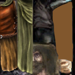 The next step is to add shading. For an arm you'll want to place some fold lines in specific places - where the arm will bend, for exanple. More folds would exist around the cuffs, and near the armpit. When in doubt, go grab a shirt, move your arm a bit and look how the folds behave. Draw based on those. So grab a bursh, size 5-13 or so, low hardness, and start burning. An exposure of 15% is good. You'll want to create a series of major folds that you can base later detail off of. I drew this set off of one of my own rainjackets. 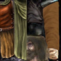 Then you're going to take a size 3 brush, slightly higher expose, and accentuate. You can also add some smaller fold lines. 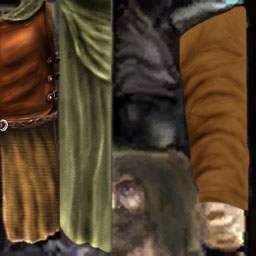 Then, switch to a dodge brush, low hardness, varying size, and create the highlights to oppose the shadows. 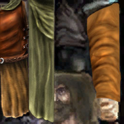 As is common with dodging on highlights, the saturation has been increased a bit too much, so take a sponge tool on desaturate to lower the saturation ununiformly. As well, you may want to apply some shadows at the top of the texture, to give the illusion that the cloak covers part of the sleeves, and some highlights on the cuffs, to give the impression that they are lifted a bit, and loose. |
 |
|||||||||||||||||||

"One site to rule them all, one site to find them, © All Rights Reserved Eric Edwards ©2013. |
|||||||||||||||||||||